Xcode 4: the super mega awesome review
posted on
So it is finally here. Xcode 4 has been released into the world and we are now allowed to talk about it. As my review of Xcode 3.2 went down really well I thought I would have a go at reviewing Xcode 4 in depth. I'll also be publishing other posts over the next few days going in to some of the bigger changes since 3.2 in more detail and hopefully helping you migrate. I've also put in radar numbers for all bugs and feature requests, so you can file duplicates or so any of the Xcode dev team reading this can find them. So without further ado, what is new in Xcode 4?
User Interface: it's all new and shiny!
The first thing that will hit you when you launch Xcode 4 is the UI is quite a bit different. The toolbar is sparse, there's some iTunes-esque LCD display in the middle and everything (code editor, project navigation, inspectors, debugger etc) is contained in a single window. On the whole, the new UI is very clean though it takes a while to get used to. Of course while those coming from Visual Studio, Eclipse or even Xcode 3's all-in-one mode will feel right at home, those who preferred the condensed mode may find it hard to adjust.
Even though some may be uncomfortable, the decision to settle on an all-in-one UI does allow for many interesting and exciting improvements to other parts of the UI. I'll cover some of these now but a few require much much detail and so are covered in later sections.
Workspaces
In Xcode 3 a project was the top level entity you dealt with. Your project contained your files, your targets, your executables and sometimes even references to other projects. Xcode 4 introduces a new top level entity: the workspace. Every window with an editor in Xcode 4 is a workspace. It can be as minimalistic as a text editor in a window or packed with a UI editor, find results panel, document info, media library and the debugger.
So why do we need a new top level object and what does it bring us? Well the answer is simple: multiple-project support. It is rare that you'll only ever have one project on its own with a large application. You may have plugins or frameworks that are in their own projects. Unfortunately you can't easily access the files of one project from another in Xcode 3, even if you have a cross project reference. Workspaces allow you to have several projects in one window. You can view the files of all projects at once (including for cross project references).
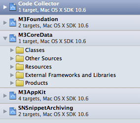
But it is even more than just seeing the files. Each workspace has its own unique build folder and its own index. This means that build folders won't conflict (and you never have to remember to trash the build folder again before you send a project folder to someone). It also means that you can perform actions such as find and replace across multiple projects at once, to easily see how a change in your framework will affect the app that uses it.
Workspaces also bring with them one of the new bits of "magic" that Xcode 4 does for you: Implicit Dependencies. Previously, if you wanted to include a 3rd party framework or library, you copy a build of it into your project folder. You then link against that built version and possibly copy it to your bundle. This still works just as you would expect in Xcode 4. However, if you add the project for the library to your workspace, Xcode will detect this and when you next build, it won't use the built version from your project folder but will instead build the framework as a dependency. When you're done you can remove the project from the workspace and go back to using the pre-built version.
Another new feature we get from Workspaces are tabs (finally). But before you start jumping for joy, these aren't tabs like you'd expect to see in every other text editor and IDE on the planet. These tabs are more akin to a web browser, where everything below the toolbar gets swapped out. Now tabs could be great, but at the moment they're kinda lacking (this is a theme you'll see a lot in this review). Being able to set up different UI setups within a workspace could be invaluable. You can have tabs for text editing, NIB editing, debugging, testing etc, which all show only the panels that are needed. The issue is you need to use the mouse to jump to a specific tab. It would be great if you were able to assign key combos to tabs so you can easily flick between them (rdar://8688957). Of course what would be better is if there were tabs for currently open files.
Lastly, workspaces aren't all kittens and fairydust. They have trouble remembering their state between launches. Most annoying is when you double click a file to open in a new window. If you close the main window before this second window, the next time you open the workspace it will be laid out like the second window. This means you need to set everything up again. (rdar://8993579)
The Navigators
Xcode 3 had one of the worst bits of UI of any Apple products. It was called the "Groups & Files" list. Now there were ways to improve it, but it was essentially one view that was trying to do too much. It was a file manager, target browser, find results list, SCM controller, symbols list, breakpoint manager and more. Thankfully, Xcode 4 does away with the Groups & Files clusterfuck and replaces it with something infinitely superior: navigators.
There are 7 navigators: Project, Symbol, Search, Issue, Debug, Breakpoint, Log. They're all fairly self explanatory. They let you navigate various aspects of your project in an elegant way. I'm going to focus on just the Project, Search and Debug navigators here.
The Project navigator gives you the bog standard view of your files and groups. It shows your classes, frameworks, resources, products etc. However, there are some nice improvements. At the bottom is a filter bar. This has 3 pre-set filters for recently changed files, unsaved files and files with scm status, as well as a search field with which you can filter files across all projects in the workspace. One issue though is the inability to save filters or flatten results so they don't show groups. Such functionality would replace the smart folders from Xcode 3, which are sadly lacking in Xcode 4. I didn't use too many smart folders, but I had some ones I relied on, in particular one showing all the nibs in my project. (rdar://8993589)
Unfortunately, while it is improved over Xcode 3, file management still has a really fundamental flaw. You can map groups to folders on disk. If you create a new file in a group it is then added to that directory. However, if you drag a file into that group it isn't moved to the directory. It is something that has annoyed me ever since I figured out how to map groups to folders many versions of Xcode ago and is really a fundamental aspect of file management that is still lacking. (rdar://8869962)
The search navigator is the workspace wide Find & Replace. The navigator itself is just your standard find and replace panel and most of the same settings seem to be there, though the find options panel seems to have been replaced by a find scope sheet which is easier to understand. But if it is pretty much the same then why is it interesting? Well there is a cool new button for when you are doing mass replacements: the preview button. Clicking this button slides down a sheet that gives you a diff for every change and lets you select which changes to go ahead with.

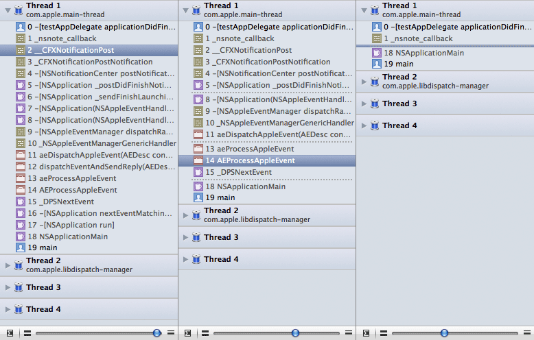
The final navigator I want to highlight is the debug navigator. This is where your stack appears when you stop in the debugger. The stack information is much cleaner and easier to reach. You can view multiple threads at once and have Xcode filter out threads that aren't relevant. On top of this though is a really great new feature (that also appears in Instruments) called Stack Compression. At the bottom of the debug navigator is a slider. As you slide from right to left, Xcode takes out stack frames that may not be relevant. It goes from a full stack trace, though just showing where your code calls into or is called by library code, all the way down to showing just the frame where the breakpoint was hit.
Inspectors
Inspectors coalesce the various info panels and inspectors of Xcode and Interface Builder. Many of them are context sensitive, so IB inspectors only show when you have a NIB open, the Core Data inspector only shows when you have a data model open. They are very similar to how IB 3's inspectors work so there's nothing new to learn.
There are two ever present inspectors though. The first is the File inspector. This shows details like the location on disk, localisations, text settings, target membership etc. It is great to have a compact overview of a file, in particular the ability to quickly see and change the targets a file is in. The second is the Quick Help. Now Apple has been experimenting with adding context sensitive, compact help since 3.0. We've had the research assistant. We've had the pop up quick help. And now we also have the Quick Help panel.
Of course the issue with all of these is that they're completely useless most of the time. A lot of what is shown isn't relevant and what is shown isn't all that well laid out. It is usually just something to get to the full documentation faster. Now the Quick Help could be incredibly useful in one area: code completion. Visual Studio is excellent with this, displaying documentation for completion options, letting you decide the best to choose. If context sensitive help was added here (and it showed the full docs) then it would be great. (rdar://8993591)
Libraries
Below the inspectors are 4 libraries: File Templates, Snippets, Objects and Media. Objects and Media are just the IB library equivalents. One thing missing though is the ability to view groups of items in the Object library. Groups are still there in the pop up menu at the top, but it was nice to view all items but seem them still visually grouped. (rdar://8993592)
The File Templates library is quite interesting. As the name suggests it contains file templates, which you can drag to the project navigator to create a new file from the template. Now I say that it is interesting because it is duplicating functionality that already exists and doing so in an inferior way. The only way to create files from these templates is by dragging them with the mouse, and then you get no options other than naming them. You also have no sort of grouping beyond iOS vs Mac, granted there is a filter list.
It puzzles me why this feature exists, given that it is just as fast to go through the File > New panel, which you can do entirely from the keyboard and offers extra options and a better layout. It feels also as though the Xcode team realised they needed libraries for IB but wanted to justify a library section being visible outside of NIB editing and so added a file template section.
What does justify the library being around is the code snippets section. This allows you to create small code snippets that can then be suggested by the code completion system. I've used this to finally add a completion for a class extension. One small issue is that snippets (especially ones you've made) can sometimes get in the way of other items when you bring up code completion.
The media library also doesn't seem to fully realise its potential. When dragging an item from it to code, it only puts the file path in the editor. It would be nice if it added the appropriate code, such as [NSImage imageNamed:@"MyImage"] for images. (rdar://8993594)
Jump bars

Jump bars are a relatively new concept in Xcode. They've existed in other applications for a while and can be quite useful. Essentially they're a combination of a breadcrumb bar and a navigation menu. They let you navigate through your entire project. Their use for navigation between files is somewhat limited though. They are quite handy, but I suspect those who are used to using the Groups & Files list will use the Project navigator and those used to Open Quickly will continue to use that. However, where they excel is navigation inside of a file. The class overview popup from Xcode 3 is now part of the jump bar, and when you open a nib you can navigate quickly down through to the object you want. When you want to quickly jump around in a file or select something deep in a view hierarchy, or even just get an overview of a file, they are an ideal tool.
New key bindings
Apple has taken the the opportunity to re-assign many key bindings in Xcode. Many are ok but some are downright annoying. Open Quickly is now shift-command-O, which while this makes sense means that all the debugger keys have had to be changed. Step Over/Into/Out have been assigned to F6, F7 and F8 respectively, in a nod to other IDEs but ignoring that fact that these keys often do stuff already, usually system wide stuff.
On the plus side though, the general UI is much improved. You can see all key bindings at once or filter by Menu or Text bindings. By default the various groups are open, which while a relatively minor change is much appreciated. And last but by no means least, we finally have a search field to filter down the various key bindings to find the one you want. That said, there are options missing. There is currently no way to customise the key bindings for switching between the inspectors or libraries for example. (rdar://8897968)
Editing: Xcode gets brains
There have been many criticisms of Xcode, especially from those coming from other platforms. "The UI sucks", "the key bindings are different", "it doesn't give me a blow job upon a successful build". Most of them are silly complaints that boil down to either a) Xcode is different, or b) an inability to check if a preference exists. However, there are lots of valid criticisms about Xcode, especially with regards to code completion, refactoring and other similar features. All these ones boil down to a very simple fact: Xcode doesn't really know much about your code. Thankfully Xcode 4 is more than just a pretty face, it also has brains.
The reason for Xcode's lack of code knowledge is quite simple. Xcode (and before it, Project Builder) has had GCC as its main compiler. GCC was built for compiling code, so it's essentially a black box you pass some code and settings in and get a binary out of. It is also GPL licensed which means that it needs to be held at the end of a large pole to stop Xcode succumbing to it. This has meant that Apple has had to build their own parsers for indexing the code and providing code completion, syntax highlighting, refactoring and other similar features. As such there has been a divide between what the compiler parser (the ultimate truth) sees and what Xcode's parser sees. This has led to much hilarity down the years, including many a scene of developers shouting obscenities at inanimate pieces of plastic, metal and silicon.
Then along came LLVM and the Clang frontend. A quick bit of compiler design knowledge first. Compilers essentially have 2 main components: a front end which parses and validates source files (there is usually one per language or cluster of languages) and a back end which takes the output of the front end and converts it into machine code. LLVM is the back end and Clang is the front end for parsing the main C languages of C, C++ and Objective-C (hence the name C lang).
Like GCC, LLVM is also built for compiling code, but unlike GCC it isn't the sole purpose driving the design. It is also built to be an modular, easily extendible system upon which other tools can be built. Clang builds upon this and, on top of providing a compiler front end, also provides a public API that allows you to access the compiler's internal index of your code. As such you can build all sorts of tools upon it, all based upon the same view of the code that is used to build the final product (and is therefore the truth). As an added benefit it is released under a licence similar to the MIT/BSD licenses meaning it can be tightly integrated into Xcode without needing to open up the Xcode source. This extensibility is what gave us the Static Analyser and what now drives much of the new and improved features below.
Improved code completion
The code completion in Xcode has gone from "reasonable but lacking" in 3.2 to "competes with the best" in 4.0. The compiler knows what it should expect and so is able to offer you only the suggestions that should work. It actually seems intelligent in its suggestions as opposed to 3.2, which showed pretty much every symbol under the sun until you'd typed half of what you wanted. As previously mentioned, it doesn't show any form of documentation, which would help a huge amount, but hopefully we'll see that in a future release.
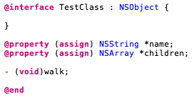
It is hard to adequately explain how much of an improvement it is in words. The best way is to show you an example. Take the header file on the right. It lists two properties and a method. We want to complete these in the implementation. Below are screenshots of what Xcode 3.2 and Xcode 4 show if you type a little bit and then hit escape to bring up the completion list:
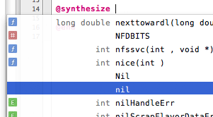
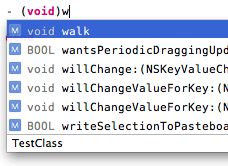
Xcode 3
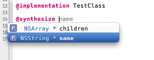
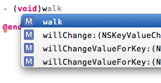
Xcode 4
As you can see Xcode 3 shows all sorts of nonsense completions for @synthesize, whereas Xcode 4 only shows the two properties. For the method, it takes into account the return type of the method and only shows the methods that return void, unlike Xcode 3 which shows any methods beginning with 'w'. On top of this, after you've synthesised a property or implemented a method, the auto complete will no long give you it as a suggestion.
The code completion is based upon Clang 2.0, which as well as C and Objective-C, now has full support for C++. I'm not a big C++ user, but from the demos I've seen the code completion for C++ is just as good as for plain C and Objective-C.
Fix It

Clang does a much better job than GCC at dealing with errors while parsing. When it encounters an error, say it expected a semicolon, when it continues parsing it assumes that one was there. This isn't perfect but it does help reduce nonsense errors. Of course because Clang has some idea of what would fix an error or a warning, it is able to also provide that to tools that use it. As such, Fix It is born.
Fix It is very simple. It parses your code as you type, highlighting warnings and errors and in some cases provides suggestions for how to, well… fix it. The example on the right is one I commonly hit, caused by the ambiguity of assignment in an if statement. While the code is fine, it ideally should be enclosed in another set of brackets so as to differentiate it from where you meant to check equality. As such Xcode offers you two options to correct it.
There are plenty of other fixits including for misspelled symbol names, missing semicolons and many more. Sadly, one Fix It that isn't there but I'd like to see is for importing a header. (rdar://8813882) The compiler knows when a symbol is missing and the full project index should be able to give a list of files where the symbol is potentially defined, so there should be enough core components in order to add this functionality. Hopefully we'll see this and other Fix Its in the future as Apple improves the feature.
The compile as you type also ends up feeling like a game at times. It's a race between you and Xcode as to who can detect a problem first. I've actually found I type and find errors faster because of it, even in other apps that don't have it. Sadly though, it does sometimes fall out of sync with the compiler, despite using the same parser. I suspect this is mainly due to refresh intervals and switching between files can often help clear it up.
Refactoring
One of the weaker aspects of Xcode is refactoring. Prior to Xcode 3 there was no refactoring at all. I was hoping that with the integration of Clang that Xcode 4 would offer improved refactoring, but it seems this area is relatively unchanged. The UI is a little different, but you get the same few options: rename, extract, move up, move down, create superclass, encapsulate (modernise loop has been removed). There are still the same problems where Xcode is very temperamental at allowing you to even attempt a refactor. Hopefully in future versions we'll see some big improvements.
One area of refactoring that has improved a lot is the Edit All In Scope feature. It finally properly respects scope, unlike in Xcode 3 where "scope" meant "method". Unlike with Xcode 3 I've yet to swear at the feature and wish painful deaths upon its implementors, which is a good litmus test for whether something is well implemented or not.
Interface Builder Built-In: Xcode and IB, sitting in a tree
Ever since the dawn of time, there has been one app for editing code, compile, debugging, project managent etc and then Interface Builder for editing user interface. Back in the IB 2.x days you had to copy the headers over to IB at regular intervals in order to expose outlets and actions to connect to. Then with IB 3 there was some degree of integration, with all the header copying being handled automagically. Sadly parts of this integration broke with successive releases (such as Xcode saving nibs before compiling) and it was still really a hack. Apple has decided that enough is enough and has built Interface Builder into Xcode with version 4, making it a truly integrated development environment like many other IDEs.
Improved UI
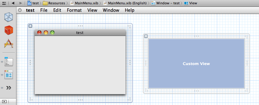
So the first thing you notice is the improvement to the UI. Rather than each window, view and menu floating around on your screen they are all on a canvas with a nice grid paper background. One of the best results of this (besides no longer having to search for that tiny view amongst a sea of windows) is that you can resize windows and root views from any side, making it easier to just resize just vertically or horizontally.
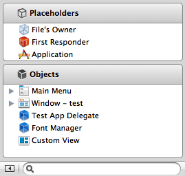
On the left you have the document well, which contains the objects in your NIB. Much like the dock, there is a divider between types of objects. At the top you have various proxy objects such as files owner, first responder and the app and below you have the actual objects in the NIB. A little circle next to objects shows that they're currently visible on the canvas. If you're wanting more than just icons though you can expand into list view (column view has been removed, though the jump bar provides an adequate replacement). In list view you gain the ability to drill down through the hierarchy, rename objects and filter them.
The inspectors are pretty much the same as they were before, though they have been re-arranged somewhat. Also if you're used to switching between them with hot keys, you'll need to throw out that muscle memory as the IB inspector hot keys are now taken by the navigators. I don't find the inspectors as visual appealing as the IB 3 inspectors. It feels like the controls have been squashed too closely together, though this is a minor complaint.
One small loss though is that of the font menu. I used to like being able to take a label and hit command-B to make it bold or use command-+/- to increase or decrease the size. Those commands aren't available any more so you have to resort to the inspector.
Integration
As you would expect with building IB into Xcode, the integration between your NIBs and your code is even greater than ever. IB has up to date knowledge of your code, though there are some cases where a save is still required before it picks up on changes. It also addresses the longstanding bug with Xcode 3 where it wouldn't warn you of unsaved NIBs when you wanted to compile.
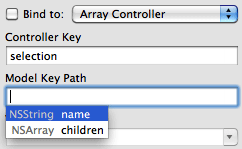
One brilliant example of where integration has been improved is with bindings. In IB3, you could set the class that a controller represented, but that would do little to aid you when filling out the key paths. You only got completion suggestions for key paths you had already entered. In Xcode 4, you will get suggestions for the properties on the class. Better still, it isn't limited to just properties on the current class but also on any properties on the objects returned. One limit though is that it only works with properties and not standard accessors. Xcode 4 will put up a small warning (though not a compiler warning) if it can't validate the keypath, so for example doing myString.length as the keypath, while valid, will show the warning as length is not a property.
The most demo-worth improvement though comes from the ability to have code and NIB side by side in a split view. Previously if you wanted to define a new action or outlet, you had to go to the header and type in the definition, then go back to IB and hook it up and then go back to your code again to synthesize the property or write the action. All that work has been reduced. With the code and NIB in different panes of a split view you can drag from your NIB to your code to hook up or even create a new outlet or action.
Now many people have seen that, but what I doubt they have seen is that this also works for bindings. I discovered this entirely by accident while playing around one day.
Loss of IBPlugins
For all the cool new hotness in Xcode 4, there is one big gaping hole in its functionality. IBPlugins cannot be loaded and as such any NIBs that rely on components from them cannot be edited. They can be compiled, but only if you have Xcode 3 and IB 3 still installed. This is a major missing component, though it isn't unexpected. A line has to be drawn at some point in order to say "this is the first version we'll ship" and IBPlugins are likely one of the things that didn't make the cut for 4.0. Of course the big issues with IBPlugins is they don't work with iOS. My hope is that they're missing because Apple is working on an improved system and would rather leave it out of 4.0 than ship a half implemented solution. That said I hope they don't completely replace the IBPlugin system as it is incredibly powerful and one of the nicest plugin systems I've coded for.
Project Editor: I want to marry whoever worked on this
You may not have gathered this from the header, but I think the project editor is one of the best new things about Xcode 4. It is the best example of how the all in one layout allows for vastly improved UIs for various components. So what is it? Well it is an editor for project and target settings. You can set up build rules, build settings, build phases, the Info.plist etc. It has had a huge amount of thought put into its design. I'm going to go through a few parts of it to highlight some of the best improvements.
Target Info
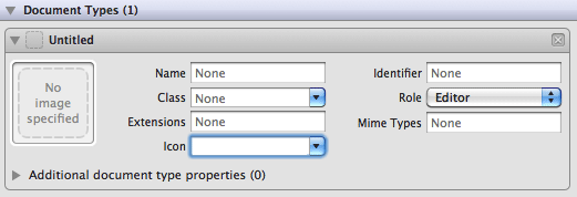
In Xcode 3, there wasn't much in the way of dedicated UI for updating the Info.plist. There were a few field and a table for document types, but at times it was easier to just edit the plist manually. In Xcode 4 this has changed. The dedicated fields for the UI have been slimmed down to just the essential with almost everything else being put in a plist editor. Below this editor though are several sections dedicated to certain sets of properties: document types, exported/imported UTIs, URL types and service. These were some of the more esoteric things to manage in your Info.plist and having a dedicated UI makes them easier to create and manage.
Build Phases
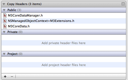
Build phases in Xcode 3 are basically just groups you threw some items into and maybe set a few properties on. In Xcode 4 each type of build phase has a dedicated UI, which is afforded them by the massive increase in screen space available. For example, the Copy Headers phase in Xcode 3 was just a list of headers, with no indication of what visibility those headers had. Instead you had to go to the target details view and modify them there. The increase flexibility allows for a vastly improved UI that groups headers by their visibility and lets you drag headers between them to change. The compile sources phase again used to be just a list of files. In Xcode 4 it uses the additional space to show you where on disk the file being compiled is and also view and edit compiler flags for specific files.
The biggest improvement by far though is to the run script phase. You had to get info on the phase in order to edit the script and then only got a rather small plain text area in which to edit, offering you none of the benefits of the editing window that you could use for your existing code. Each run script phase now has a much more fully featured code editor with syntax highlighting, line numbering and auto indenting (this editor is available anywhere that you can write a script in Xcode).
Build Settings
Build settings in Xcode 3 were a mess. You had project level settings, various target level settings, each needing their own window to view. On top of that you had to switch between configurations using a drop down in order to see differences. Well Xcode 4 has a nice big window in which to put this information. Wouldn't it be awesome if it was put in there? And what if you could see project level and target level settings side by side (and have highlighted where the resolved setting is set)? What about viewing all your build configurations at once? And maybe the ability to select multiple targets and compare their build settings? And would you like a pony with that too? Well thankfully Apple has solved all of those with the build settings window (well, except for the pony, but you can't have everything).
The new build settings panel is the posterboy for the possibilities opened up design-wise by the new UI. It takes a horribly complicated system and, while not changing anything about how it works, turns it into an understandable, elegant and, dare I say, beautiful piece of UI design.

The Assistant: "It looks like you're writing some code…"
In software, there is a large spectrum between applications that are "dumb" and only do stuff when you give it explicit input and apps that are "smart" and can preempt you. Now few apps are completely dumb and offer some degree of smarts to try and preempt you. The issue is, the more smarts you add to your app, the more you risk falling into the uncanny valley of application intelligence. The software is smart enough to do something for you, but not smart enough to do it well enough of the time, leading to frustration. It is this uncanny valley where such much loved features as the Office Assistant (aka Clippy) reside. Add to this list the Xcode assistant.
The Assistant is essentially a split view, letting you see multiple files at once. You can click a file to open in the left view and option click to open in the right view. However, it also can work out files that might be relevant based upon the file open in the left pane, such as subclasses, counterparts, protocols, files that include this file, etc. You can access these manually using the button to the left of the back/forward buttons in the jump bar. However, you can also set the assistant up to automatically update other panels based upon the file open in the main panel. I just question how useful this automatic setup is in real development.
There are some annoying issues with the assistant. For example, counterpart and automatic are different modes, despite being effectively equivalent. They show the most appropriate source file for the current selection. But counterpart is only available if you have a source file on the left and automatic is only available if you have a NIB or Core Data model. And switching between source and other files requires you to set the mode of the assistant again. It also seems to hog the option key, meaning that if you want to use option in a key binding, there's a chance it may also cause the assistant to rear its head.
I also wonder how useful the other modes are for being shown automatically. There are generally more than one file in those groups and so you rarely get the correct one. And the one mode that would truly be useful, showing the header for the current selection, doesn't seem to exist. If I select an object that is an NSArray, showing the NSArray header (or even better, the full NSArray docs) would be more beneficial.
Ultimately, the assistant isn't bad, it's just not all that useful. It serves some needs but these are relatively rare, and the needs it does solve are better suited by other measures. For example, the counterparts mode is better managed in my opinion by the Jump to Counterpart command. Down the line the assistant may become much more powerful, but at the moment it is too weak to be of use beyond a regular split view.
Schemes: not the evil variety
The two main new concepts in Xcode 4 are Workspaces, which I've already covered, and Schemes. Now Workspaces are fairly easy to understand. Unfortunately schemes are probably the most confusing new feature for existing Xcode users. It is well worth working through that confusion though as they are quite powerful and at their heart are actually quite simple. I'm not going to go into too much detail about schemes now as I'll be posting a dedicated blog post on them in a few days.
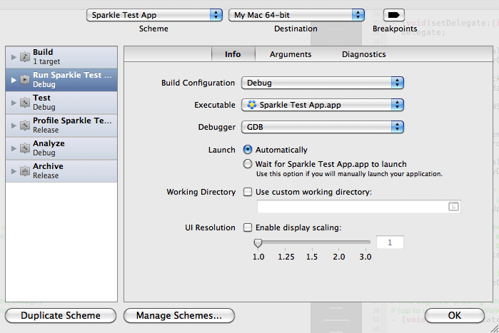
They primarily exist to replace the previous collection of settings for the launch location, the active target, the active build configuration etc. Now while there are many combinations of settings available, there will only be a few that you will ever use. A scheme is essentially encapsulating that, allowing you to configure those few combinations and switch between them. But they're much more powerful that that as well. They let you set up an environment in which the actions of building and testing, running, archiving, analysing and profile are defined. You can configure what environment variables to do on run, what tests to perform when you test, what templates to use when you profile etc. You can also define actions to run before or after a stage, though these are currently limited just to running scripts and/or sending emails.
While confusing, they are potentially one of the most powerful changes in Xcode 4 and can massive simplify the process of actually building and acting upon your code.
Debugging: better than just swatting at flies
Debugging is an important part of your development workflow. You can potentially spend half of your time, if not more, debugging. Xcode hasn't been too bad for debugging, but not too great either. Much like how many features have been hindered by a monolithic, old, GPL based compiler, debugging is somewhat limited by a monolithic, old, GPL based debugger: GDB. Of course not all of the blame is with GDB, there are parts of the debugging UI that could have been improved. Apple has addressed both of these to varying degrees in Xcode 4, though they've had more success with some parts than others.
Improved UI
The UI for the debugger is much more elegant in Xcode 4, while also being a lot more powerful. As previously mentioned, the stack trace has been moved to a navigator. Another navigator available is the Breakpoint navigator. This is the one stop shop for managing breakpoints. You still set a basic breakpoint by clicking on the gutter in an editor, but you can create symbolic and exception breakpoints from the navigator.

To edit a breakpoint you simply right click and choose "Edit". This brings up a popup window with various options, depending on the type of breakpoint. For plain file-based breakpoints you can set your usual condition, ignore count and actions. Symbolic breakpoints you can set the symbol and library. Exception breakpoints are the nicest though, giving you simple pop up lists to choose between stopping on all exceptions or just C++ or Obj-C exception, and to choose whether to break when the exception is thrown or caught.
The main debugger UI appears at the bottom of the screen. It has 2 columns: variables and console. The console view is the same standard console as Xcode 3. However, you can now choose to filter the output to show only debugger output or only output from the running target. The variable view is also much improved. You can choose to show all variables, just local variables or have Xcode automatically decide which variables to show. This last option is probably the most useful as it shows the variables relevant to the current context. It will show the local variables, but also other variables accessed within the current scope, such as instance variables. You can also perform a textual filter of variables, both by name and by value.

LLDB
In order to "fix" GDB, Apple has opted to replace it. The replacement takes the form of LLDB, or the Low Level Debugger. As you can probably guess, LLDB is to LLVM what GDB is to GCC. But it is actually much closer. LLDB is built on top of LLVM for things such as expression parsing and fundamental data structures. As such LLDB should (theoretically at least) never lag behind the compiler in supporting new language features.
The main design focus of LLDB is on speed and efficiency. It aims to be much faster than GDB, take up less memory while running and be much more intelligent about what it needs to parse. It also focuses on ease of use. The command structure is designed around consistency and a basic noun verb format. And on top of this, much like it's sibling compiler, it aims to be highly extensible. LLDB exists as a framework, LLDB.framework. Both the command line and the Xcode interfaces are built upon this framework. There is also a Python scripting interface that has full access to the LLDB API. It is as much a tool for building debuggers as it is a debugger itself.
The use of LLVM for expression parsing means that LLDB should be much better than GDB at supporting all the language features the compiler does. It performs JIT compilation of expressions you enter. Now the key word is "should". From my experience it is somewhat lacking in its expression parsing. It's no worse than GDB, but it falls short of the promise of high quality expression parsing. One example from my testing is that it, like GDB (and myself), is not a great fan of the Obj-C property dot syntax.
And this really is pervasive throughout LLDB. It seems half baked at the moment. It is a coin toss as to whether it will actually load your application when you launch and I've had occasions where it will cause Xcode to hang, requiring a force quit and relaunch. This isn't to say that there is something fundamentally wrong, it is simply the first release. Much like when LLVM was first added to Xcode, it was nice to experiment with, but wasn't really ready to use as a main compiler. I highly recommend trying it out, it may work better for you than it has for me. Hopefully, over the next several releases of Xcode 4 we'll see it mature to the point where it is stable enough to drop GDB and use it full time.
No "Preprocess" or "Show Assembly Code" commands
There has been some controversy over the loss of two commands in Xcode 4 that aided debugging. The Preprocess command ran your source file through the C preprocessor and displayed the output, which was incredibly useful for debugging preprocessor macros. The Show Assembly Code command showed the assembly that was generated for the class, so you could debug issues or look for performance improvements. Neither of these two features are available in Xcode 4, providing no obvious way to replace this functionality. I haven't been affected by them too much as I rarely need them, but for those who do it is potentially a reason to hold off ditching Xcode 3 completely.
Version Editor: a TARDIS in your IDE!
The common theme with Xcode 4 is the folks at Apple saying "What was a valid criticism of our dev tools?" and looking to fix it. One of the valid criticisms is that the SCM support was pants. It was hard to set up, difficult to keep working and generally it was easier to use another tool. The Version editor is what serves as replacement for what we previous had, and it is a pretty reasonable effort.
The key thing about it is that it works and it works quite well. It supports Subversion and Git (and drops support for CVS and Perforce). It's not exactly exposing every last feature and only has the essential operations such a branching, committing, logs, annotate/blame, merge and push/pull, but you don't need much more than that for day to day work. Unfortunately there is no support for other DVCSs such as Mercurial and Bazaar and no sort of plugin system to allow 3rd parties to support them. Hopefully they'll make it in, but it's more of a nicety than a necessity.(rdar://8583054)
And that's really the Version editor in a nutshell. It is the 3rd main editor view after the Standard editor and the Assistant editor. Rather than something you rely on in order to get anything done, it is more something that is nice to have, if you use Git or Subversion, but you don't necessarily miss using it when you don't. As a Bazaar user I haven't had too much use of it and haven't found it affects my use of Xcode 4 at all.
Comparison, Blame & Log Views
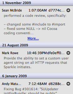
But you don't want to hear about not using it, what is it actually like to use? Well as I've said it only supports the essentials at the moment. There are 3 main views available to you: Comparison, Blame and Log. Comparison view is your basic diff between two versions. You have one version of a file on the left, another on the right and you see the difference between them. Jump bars at the bottom let you switch between revision, but there is also a timeline that can be slid up to give you a more temporal view of your commits, showing commits grouped by days and their commit message as you hover over. It's a nice way to quickly go back through your history.
The Blame view is your basic who did what view. Each line has the commit's user, message and date. Each different section has an arrow that when clicked will take you to a diff of the commit in the Comparison view. Finally the Log view is about the most basic Log view you'll find. Message, date, committer's name and revision number/hash. You can't even click on a commit to see the selected file as it was there, you need to click an arrow to be taken to the Comparison view.
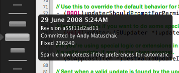
The one thing that is apparent though is that not too much time was spent on the UI aesthetically. It is perfectly functional and very easy to use, but the Blame and Log sections are rather… meh, visually. The Comparison view would be the same but the timeline is a nice visual touch. It seems like a bit of a nitpick, but given how much of the UI is nice to look at in Xcode 4, it's a shame these are so bland.
Committing
I'd like to highlight committing as it is the one area where Xcode 4 does something that is (as far as I'm aware) unique. Now the commit sheet is your basic commit UI. It shows the changes being committed (either as a flat list, their in app representation or on disk representation) and shows you a diff of the changes. You can also continue to edit in this sheet if you wish. However, the real magic comes if you've got multiple projects in a workspace, one in Subversion and one in Git. If you make changes to both and then commit, you'd expect to have to commit the Subversion changes and then the Git changes. But what you can do is commit to both, with the same message, with just one action. Xcode handles everything for you, meaning that Subversion and Git are not just equal, but you don't really have to care too much which is used under the hood.
Documentation: RTFM!
Apple has tried repeatedly to get documentation right. They have some of the highest quality documentation around, but accessing it in Xcode was always a pain. Many people used it only if needed or switched to other apps to handle it. In Xcode 3.2 they finally nailed it. It was quick and easy to use from the keyboard, it was incredibly functional, yet was very simple. You could get in and out with minimal fuss. It was a joy to use.
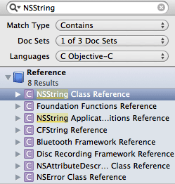
Unfortunately they decided that, as they're redesigning everything else, why not also redesign the Documentation viewer. What could possibly go wrong? Well unfortunately a lot. Firstly, it doesn't search as you type any more. I've used search as you type many times when I don't quite know the name of something but sadly this is missing.(rdar://8691689) Next, keyboard navigation is messed up. The search options, rather than the search results, are now directly after the search field when you tab. Of course you could just hide the options, but then you can't see what options are selected and if, like me, you're often switching between iOS and Mac development, you want to be able to change the scope often.
The search results are also much less useful at a glance. In Xcode 3.2, the top section of results was for API results that match. It listed functions, classes, methods, constants etc as a flat list. In Xcode 4 they're now an outline view grouped by the file they're in. This means to actually see the search results you have to go through and open every bloody arrow.(rdar://8993605)
And then the actual documentation view itself is vastly inferior to what was in Xcode 3.2. Gone is this table of contents sidebar that was easy to glance at and scroll through and gave a great overview of the class. Sadly, jump bars have replaced it.(rdar://8689086) While jump bars are great in most of Xcode, this is one of the places where they are crap. They replace a list with a large target area for scrolling with a series of nested menus that are a pain in the rear end to navigate. And to top it all off, those occasions where you would like to view the PDF version? Well tough cookie, there's no way to view it beyond opening in the browser first.(rdar://8993604)
Of course, screwing up the documentation view isn't the only thing that has happened. You can no longer command-option-click on a symbol in the editor to use it as a search term. This was one of the most frequent ways of searching for documentation, but now the only way to get to useful documentation on a symbol is to get quick help and then go to the full documentation.(rdar://8689104)
Of everything in Xcode 4, this is by far the worst change. They've taken arguably the one thing that Xcode 3.2 got very right and turned it into, what can most politely be described as, a steaming pile of donkey shit. Sure you can use it to find documentation, but you can use TextEdit to write code, it doesn't mean it's particularly good at it.
Testing: 1,2,3
The best thing to say about automated tests in Xcode 3.2 was that they were possible. That's actually probably a little unfair. There were templates for unit tests, there was support in the build UI. It wasn't the dark ages, maybe just the 1700s. The big issue was that testing felt like an afterthought and was tied to the build process, with the job of actually testing thrown onto an external script.
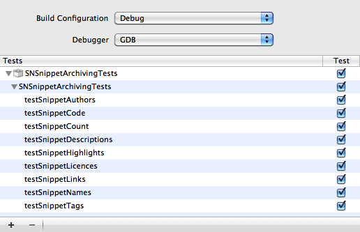
In Xcode 4 testing has improved in almost every way. Almost every project template now has a checkbox to add unit tests to the project, meaning you no longer have to perform all the usual set up. In fact most of the setup is now redundant and simply there for backwards compatibility with Xcode 3.2. For example, there is still a build phase to run a script to run the tests, though this isn't actually used.
To run tests, you no longer select the test bundle target and build it. Instead you use one of the new menu commands: Test or Test Without Building. The former performs a build and then test, the latter, well you can guess. So how does Xcode 4 know what tests to run? Well you choose from the test section of the current scheme. Here you get a list of all the test bundles, test suites and individual tests and can check or uncheck those you want to run. This means you can set up a development scheme with a few tests and have a release scheme that runs your whole test suite. This is a massive jump over what was in previous versions of Xcode.
There was also another really major complaint about testing in Xcode, the inability to debug tests. The only way to figure out what was going on with tests was to throw in some NSLogs and then search through the build log to find the result. Xcode 4 now runs your tests in the debugger, meaning it will hit breakpoints in both the tests and the tested code. I know of a few people who may well be crying tears of joy at this.
For all the the wonderful improvements to testing there is one major downside. The UI for testing is still in the build results, which is rather cramped. It would be nice to have a dedicated UI for testing, maybe a navigator, that let you view the test successes and failures and maybe view past runs. (rdar://8993596) Besides this though, testing has made a massive leap forward in Xcode. If Xcode 3.2 was the 1700s, we're now approaching the late 20th Century in Xcode 4.
Behaviours: be on your best!
Behaviours at first seem like a minor addition to Xcode. They let you make things happen when a certain event happens, such as a build succeeding or a test failing. You can have sounds play, bezels show, switch navigator or tab, run a script etc. These are all quite useful abilities. For example you can have the debugger show when you start running and hide when you've finished a run. Or you could have Xcode read out the results of a long build once it is finished.
There is nothing too exciting about them in their current state, they're just a nice but minor feature. So why dedicate an entire section to them? Well it is their potential that is so exciting. Imagine if you could have a behaviour for when a certain type of file is selected. (rdar://8689025) When a NIB is selected you could switch to the assistant editor to let you hook up connections. When a source file is opened you may not need the inspectors and library so you could have them hide. What about behaviours for when you add or remove a file from the project? There are lots of possibilities available for both events that cause behaviours and behaviours to perform. Hopefully we'll see lots of improvement to this feature in the future.
One flaw though is that behaviours are global. It would be nice to have either behaviour sets or even project specific behaviour overrides. (rdar://8935330) One example is that I have the debugger set to hide when I quit the running application. That is great for regular apps, where any console output I want to see I can see before I quit. For command line apps though, I want the debugger to stay up after I quit. At the moment I need to change my prefs depending on which project I have open. The ability to override these in the few command line apps I have would remove this hassle.

Conclusion: yay or nay?
Xcode 4 is an interesting contraption. It has 4.0 as its version number, yet it is almost a 1.0. Xcode 1 to 3.2 were almost transitional, helping the migration from Project Builder to what we have now. In a sense Xcode 4 shouldn't be judged on what it is, but what it shows it will be. The one thought that keeps popping into my head while using it is that there is a lot of cool new stuff, but it is lacking. The foundations are pretty much all there to build an Xcode that can compete with the likes of Visual Studio and Eclipse on all fronts. They just need fleshing out more. There are very few areas where Xcode 4 is worse than previous versions. The majority of those areas are where the features simply aren't there, but where they may re-appear in future versions. In every other area it offers major leaps forward in usability, performance and enjoyment.
I've always considered Xcode to be the nicest IDE to use in terms of user interface, though it wasn't exactly pretty. It's just the competition was so ugly and cluttered. I've often likened saying Xcode 3 was the prettiest IDE to saying that it was the nicest smelling dog crap. Xcode 4 however, genuinely is pretty. I love looking at it and admiring the amount of work that has gone into it. Apple has had some of the prettiest developer tools in terms of Interface Builder, Instruments, Quartz Composer etc for quite a while, but Xcode was dated. It now feels like the sort of user interface you'd expect from Apple.
Some people though, claim that it is the iTunes-ification of Xcode. That it is a step backwards. That there is too much garnish and not enough meat. It's a valid complaint, as Xcode 4 does lack some of the more advanced features of Xcode 3. But it is wrong to say that iTunes is the inspiration. iTunes isn't particularly great. It is old, clunky and somewhat ugly. It is more akin to Xcode 3. Xcode 4 is much closer to iLife or iWork. It is modern, it puts a large amount of focus on the UI and it tries to use great engineering to reduce the work you need to do to create great results.
So should you switch to Xcode 4? Yes, absolutely. But I'd keep Xcode 3 on your system for a while longer. The lack of IBPlugin support makes that a requirement for most Mac development. But you shouldn't give up Xcode 4 completely just for a few missing features. The many areas with major improvements more than make up for the few areas that are lacking. After using Xcode 4 for several months, I can't really move back to 3.2. It just isn't the same.
Every developer should heap as much praise on the dev tools team as they can, as they have done a fantastic job. It's hard to take a large, mature and very familiar application and take a step back and ask "how could we do this better?" Sure it isn't to everyone's liking, but nothing is. But the beautiful thing about Xcode 4 is that it is still a lump of clay that can be sculpted. There is still a lot that can be done to improve it. And if you want to see improvements, just remember to file bugs.