The Xcode 4.1 Review
posted on
Another Xcode release, another review of what's new. Xcode 4.1 coincides with the release of Lion and includes many improvements, some to help adopt new technologies in Lion and some just to make Xcode a better IDE. So lets get started with what's new.
General Improvements
To start with I'll go through a few of the general improvements. One of the big complaints with Xcode 4.0 was stability. We'd long been spoiled by the comparative stability of Xcode 3.2, so to go back to pre-3.2 levels of stability was incredibly frustrating. This new version feels a lot more stable. Assertion failures are a rarity, rather than part of the daily workflow as was the case in 4.0. I've experienced very few crashes, but then again I personally experienced very few in 4.0. If stability has been one of the things keeping you from switching to 4.0, then 4.1 will make you much happier.
Lion introduced the concept of full screen apps, and Xcode 4.1 is proper full screen citizen. I have mixed feelings about the full screen support, which generally extends to the feature for Lion in general. I can see it being incredibly powerful on laptops, where screen space is at a premium, but it seems incredibly half baked everywhere else.
When developing I usually have my workspace on my main display, but my second display can contain all sorts of stuff. It's not unusual for me to have a web page for reference, the documentation window, Lighthouse Keeper for issue tracking, a terminal window, other text files for reference and iTunes, all open on my second display. Full screen effectively nullifies that. There is also the other issue that your running app will be in a separate space to Xcode, which making it harder to debug. I recommend trying it out to see if it suits your circumstances, but don't expect it to be a ideal in every situation.
Xcode 4 vastly improved the UI over previous versions of Xcode, but did have some oddities. The schemes toolbar item, which was previous one single item for setting two values, is now a path control. This allows the active scheme and target platform to be changed independently. Apple has also removed the strange button section next to filter bars in navigators, replacing them with properly sized buttons and icons you can actually distinguish clearly. However, they still haven't replaced the odd filter bar icon with something that makes more sense like, well… anything else really.


Interface Builder
Lion brought with it lots of great new APIs, many of which you can find out about in this post from Ole Begemann. With these new APIs comes improvements to Interface Builder to support them. At the most basic you get support for new controls such as popovers, text finders and inline buttons, as well as the nice improvement of a custom NSFormatter object you can drag to controls. There are 3 more important changes though:
UI Identifiers
Lion brings with it the new Resume feature, to make it easier for developers to restore application state between launches. One of the important parts of this is giving UI elements identifiers. There is now a standard identifier property that can be found in the Identity inspector (this can be confusing at first if you're used to using views with their own identity property such as table columns). This identifier can potentially be useful in places other than Resume though. View based tableviews use them, and they are accessible via the Accessibility API which allows for many interesting possibilities.
View-based Tables

iOS developers generally don't know how good they have it when it comes to providing custom cells for a table. They can use the nice, clean, familiar APIs of NSView for their cells, but on the Mac we've long had to deal with the monster that is NSCell. Lion vanquishes this monster by introducing view-based tables. Now Apple could have stopped at just making it work like UITableView on iOS, but instead they've made it much easier to use.
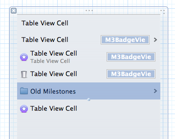
Much like with iOS, view-based tables hold a queue of views that can be reused, and you should first ask the table for a cell from its queue before creating one yourself. This creation can be done simply by instantiating an object, but can also be done from a NIB. On the Mac, NSTableView is heavily optimised for the latter case. You don't have to create a separate NIB for your cells, but instead can just drag an instance of NSTableCellView from the Library to your table, and the table creates its own self contained NIB within itself. All the cells in your table can then be edited within the single NIB. You then simply assign these cells an identifier and then all you need to call is the following method:
[myTableView makeViewWithIdentifier:@"MyCell" owner:self]The table view will then pass you back a cell from its reuse queue, or if one doesn't exist, handle the creation of a new cell from the NIB for you. This helps remove a lot of the boilerplate code required in iOS and shift more of the cell design to IB, in a much more elegant way.
Autolayout
My favourite new developer feature in Lion is Autolayout. This is an incredibly powerful layout system for AppKit that blows away anything else I've seen on other platforms. It allows you to make incredibly complex layouts, that previously may have taken 10s if not 100s of lines of code, all from the comfort of IB. For the most part IB uses the standard HIG guides you will have seen when building your UIs, to implicitly define constraints, but you can explicitly define your own if you need more accuracy (and I've found I often do).
There are also some incredibly annoying bugs. If you try to access constraints by the object list view, whenever you modify anything the constraints section closes (rdar://9728875) and IB doesn't entirely match up to the capabilities of the API, as constraint constants cannot be set to negative values (rdar://9717632).
I won't go into Autolayout in much more detail here as I'm planning a rather extensive blog post to cover it in the near future.
Behaviours
Behaviours were a nice little addition to Xcode 4, allowing you to customise a few parts of the UI. In 4.1 they have improved dramatically. Firstly they let you perform a lot more actions. You can now show or hide the utilities sidebar and show or hide the toolbar. You can define what editor and debugger views you want to be in, and also enter and exit full screen.
The really big change though is not the actions, but the behaviours. It is now possible to add custom behaviours, that can be accessed via the menu bar, or through keyboard shortcusts. This is great if you want to have tabs set up for different tasks. I have an editing UI with no utilities panel and the file navigator visible, and a NIB UI in a different tab with the utilities visible and a file navigator filtered by 'xib'. I can switch between the two with cmd-1 and cmd-2. I then have a "show debug" behaviour set up as cmd-4 which switches to the debug navigator and brings up the debugger view.
Editors

There have been various improvements to the editors in Xcode 4, many fixing things that were simply missing in 4.0. The CoreData editors were inexplicably missing the ability to set the model identifier or the current version of a model, both of which have made a return in 4.1. A bit easier to understand, but possibly missed by more people, was the lack of assembly or pre-processed output generation for your files. This has made it back into 4.1, integrated into the assistant, so you can easily view the assembly for a file side by side with the source.
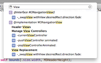
Another improvement, that I almost completely missed, is that jumpbars no longer have type to select. Now you may be thinking "why is that an improvement?". Well, in place of type to select is type to filter. As you start typing in any jumpbar, a filter bar appears and the contents of the menu is whittled down. This feels so much better than type to select if, like me, you cannot always remember what letter a method starts with. The matching algorithm seems the same as used in the open quickly panel, so your search string doesn't have to match one continuous string.
Schemes
Schemes have had a few minor improvements. First of all, the UI scaling control has been removed, due to the change in how resolution independence works in Lion. There is now finally a checkbox for NSZombie in the Diagnostics tab, which was oddly absent in 4.0. Another nice enhancement is a filter bar in the test section, which is incredibly helpful if you have a lot of tests.
Project Management
There are a few small improvements in terms of project management in 4.1. The first is the ability to "modernise" a project. What this does is go through your project and look for any setting that maybe aren't what Apple recommends. These could be defaults that have changed, or even settings that have been completely removed. It's a very useful way to update those build settings you may not even know about.
The other improvement is a UI for specifying entitlements. This is important over the coming months as we approach Apple's deadline where they require new App Store submissions to use the new sandbox. This is largely a case of selecting a few checkboxes, but of course many other issues may appear for certain classes of apps, most requiring code changes, but in some cases causing big problems (in which case, please file bug reports with Apple, as I have found them more than willing to listen to the needs of developers with regards to the sandbox).
Debugging

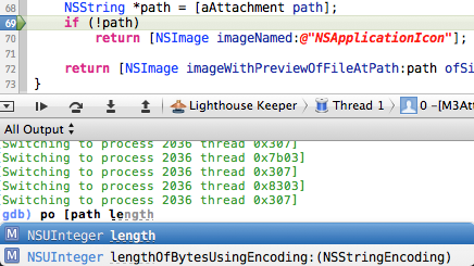
The debugger has seen a very significant improvement in Xcode 4.1. Often you have to do a lot of typing in the debugger console, of variable names, method names etc. This could lead to errors as you're having to type out everything by hand. Well now you can rejoice as Apple has added code completion to the debugger console. It provides completion related to the current scope of the debugger, so it will complete any local variables know about at the point your application is paused at, including any method or function names.
Unfortunately the other side of debugging hasn't seen quite as big an improvement. LLDB is still virtually unusable for more than basic experimentation at the moment. It isn't causing Xcode to crash quite as often, but I'm still finding it far too unstable to use as my main debugger. For now my recommendation is the same, try it out and see if it works for you, but don't expect it to replace GDB quite yet.

Documentation
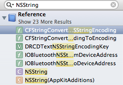
In my 4.0 review you may have concluded that I had some problems with the documentation viewer, enough for me to describe it as "a steaming pile of donkey shit". While 4.1 hasn't fixed all my complaints, they have fixed a few of the biggest issues I had. Firstly, Apple has brought back search as you type, which makes life so much easier if you're not 100% sure what search term to use. They have also removed the annoying outline view results, replacing them with the flat list that was in 3.2. While they haven't fixed everything, I no longer hate using the documentation viewer, which is in itself a vast improvement.
Improved key bindings UI
In my last review I talked about the improvements to the key binding editor in 4.0. Well 4.1 brings even more improvements, both to the UI and to the completeness of key binding support. Firstly, there are key bindings for pretty much everything now. Many editors such as the hex editor, property list editor, version editor, etc. were missing from the list of key bindings. You can now also change the key bindings for accessing the various inspectors and libraries.
UI-wise, it is much easier to work with key bindings. 4.0 provided key bindings as a flat list. There was no distinction between what was in the root of a menu, what was in a sub menu and what was an alternative to a menu item. In 4.1, menu items list their "path" if they are in sub menus and alternate items are grouped together, with the alternatives greyed out.


The scope bar also has two new items, for conflicts and customised items. The customised item is pretty self explanatory, it shows which items you've given custom bindings. The conflicts UI is rather useful though, showing any potential issues of the bindings within Xcode, but also with systemwide shortcuts.
Conclusion
I said that Xcode 4 felt more like a 1.0 than a 4.0, given how much had changed. 4.1 is the first real update to it and does not disappoint. Many features that were missing, probably due to time constraints, have finally made it in. Stability has improved a lot, but could still be better. Many of the new features have also seen minor, but highly significant improvements.
Xcode 4.0 was largely laying the foundation upon which the future can be built. It was a transition that caused a lot of controversy amongst some, much like what Final Cut Pro X has done. What a lot of people may forget, or may have even not experienced, was that the transition from Mac OS 9 to Mac OS X was just as controversial, if not more so. It was unstable, it was lacking many features people were used to, but it laid the foundation. And look at what has been built upon those foundations: Lion, iOS, iWork, iLife. Not a single person would look back now and say that Apple was mad to do what they did back in 2001, taking a dated piece of software, that was falling further and further behind the competition, and rebuilding it into something designed for the decades ahead. Xcode 4.1 is our first glimpse of what is going to be built upon the new foundations laid down by Xcode 4. When 4.2 comes out later this year we'll likely see even more.
If you haven't switched from Xcode 3 yet, I strongly recommend starting the transition soon. If you want to get the most out of the latest SDKs, you'll need to be using Xcode 4, and going forward everything is about Xcode 4. It will be rough at first, with much swearing and cursing because things have changed, but that's to be expected. I went through exactly the same thing. But eventually you will adapt and get over the differences. It's also important so you can truly find the pain points and can file bugs. I listed 18 radars in my initial post, 6 of those have been fixed, either directly or indirectly in 4.1. Apple may be the ones who make Xcode, but we are the people who they make it for and the ones who they want to listen to.