Catalyst vs SwiftUI: Which is better for building a new Mac/iPad app?
posted on
I've had an idea for a new app for a while now, one that I've been eager to start working on. It's initially going to be a Mac app, but the concept could work fairly well on iPad too. Given the rumours around a new project called Marzipan allowing you to build for both devices with one toolkit, I opted to hold off until after WWDC before starting on the app.
Unfortunately, Apple threw a spanner in the works by not only releasing Marzipan (now called Catalyst), but also an entirely new UI framework called SwiftUI. Making things even more complicated, they both seemed to solve the problem of sharing more code between Mac and iPad but they do so in different ways, each with their pros and cons.
So the past few weeks when I've had the time to spare, I've been playing around with a very simple app to try out the various options for building an app for both Mac and iPad.
The App
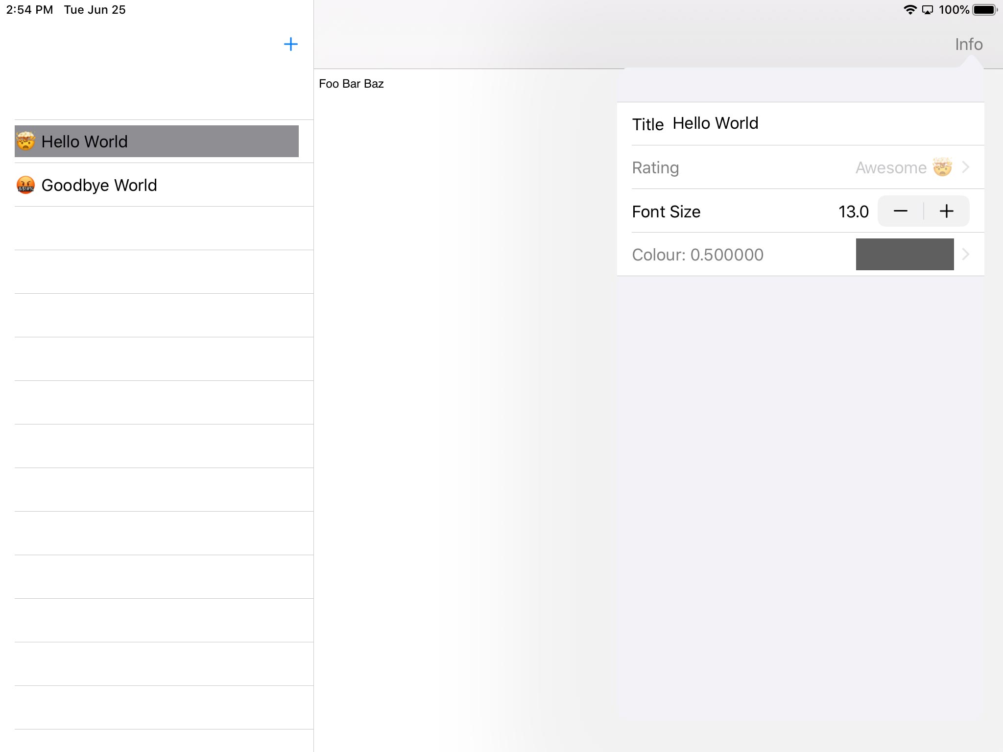
So the app I built to test these technologies was a simple note-taking app. You can add and remove notes, edit them in a text area, and edit various properties (title, rating, font size, and text colour) in an inspector. Initially I had wanted to try building this as a document-based app, but unfortunately it seems document based apps are broken in the iOS 13 simulator in these early builds, so I instead opted for a "shoebox" version.
My reasoning for such a simple app is that it shouldn't really push the various APIs too hard, and at a fundamental level is common to an awful lot of apps. To offer a baseline comparison I started by building separate AppKit and UIKit versions, only sharing the model code between the two. The AppKit app ended up being a breeze.
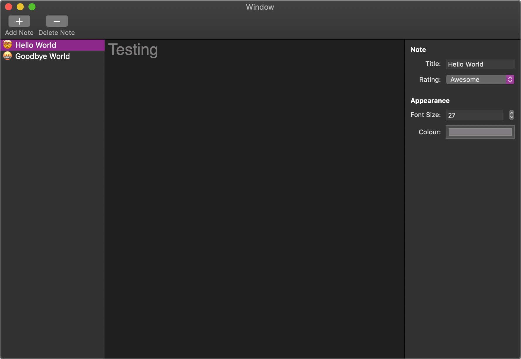
It's obviously very rough, but has all the basic functionality I wanted to test in the app. It also has very little code as most of the functionality is controlled via Cocoa Bindings.
The next step was to build the iOS version. This is where things started to come undone. It had been a long time since I'd tried to build an app that needs to allow editing a lot of data, keeping it in sync across the UI, and I'd forgotten how painful it can be with UIKit. Given the fact that SwiftUI had been announced with its own version of bindings, it made writing all the boilerplate code to funnel data around all the more tedious.
I also hit the problem that UIKit (still!) has no built-in colour picker, so I had to roll my own inferior version using a few UISliders. Overall though, the iPad app ended up not being too difficult. It had a lot more code than the Mac version but it wasn't too unreasonable.
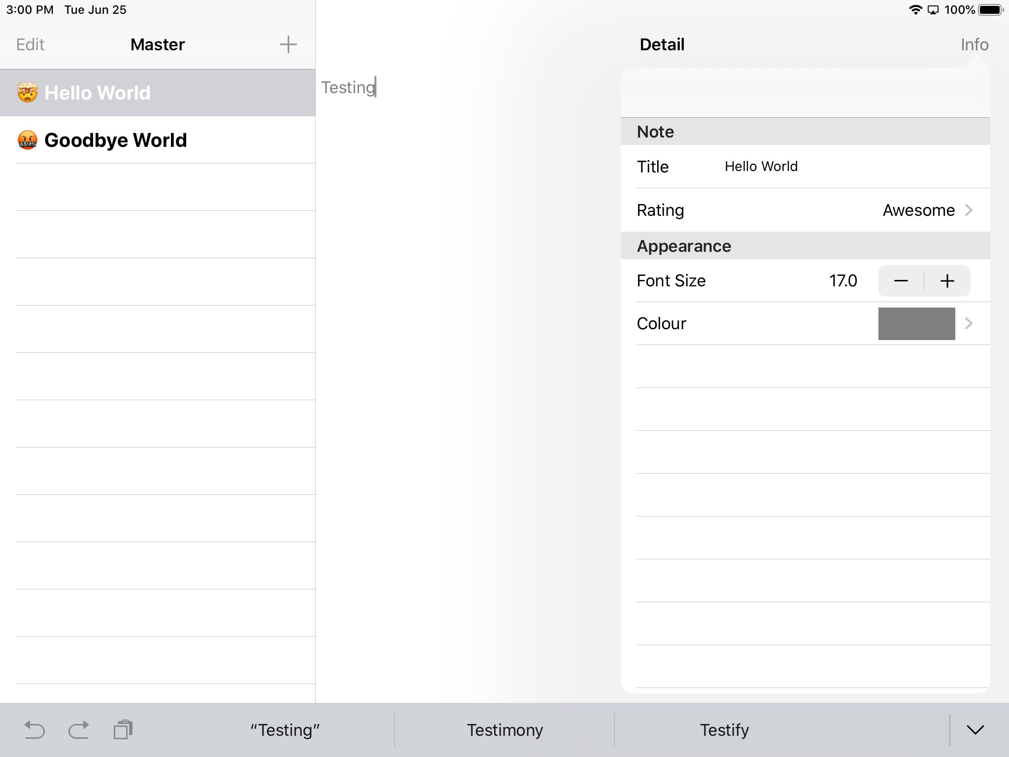
Of course the big issue with these apps is the inability to share much of the UI code. This would have been even worse if I'd managed to get the document-based variant working on iOS as then I'd have 2 different versions of that. They served their purpose though in showing a baseline of both effort and sharing code.
Catalyst
The next step was Catalyst. I thought this would be an easy enough step to do as I could just reuse the iOS code from the first app, and in some ways it was. Clicking the Mac checkbox in Xcode let me build and run my iPad app on the Mac.
Unfortunately, that is just the first of many steps if you want to actually build a high quality Mac app. A lot of this was relatively easy, just cleaning up some UI elements such as the sidebar. Unfortunately I then hit two pain points: the toolbar and the inspector. The toolbar I can mostly write off as it is an Apple bug (they hadn't included the header into UIKit's framework header so you couldn't see NSToolbar), albeit one that cost me a fair bit of time and frustration. The inspector is a different matter.
The problem I had with porting it to iOS in the first place became even more stark when it was "ported back" using Catalyst. UIKit is still not powerful enough to create a UI that feels great on the Mac. I can't use NSColorWell and the built-in colour picker, and I can't convert the rating picker to an NSPopUpButton, as you can't combine both AppKit and UIKit in the same view hierarchy. This left the inspector looking rather forlorn and out of place.
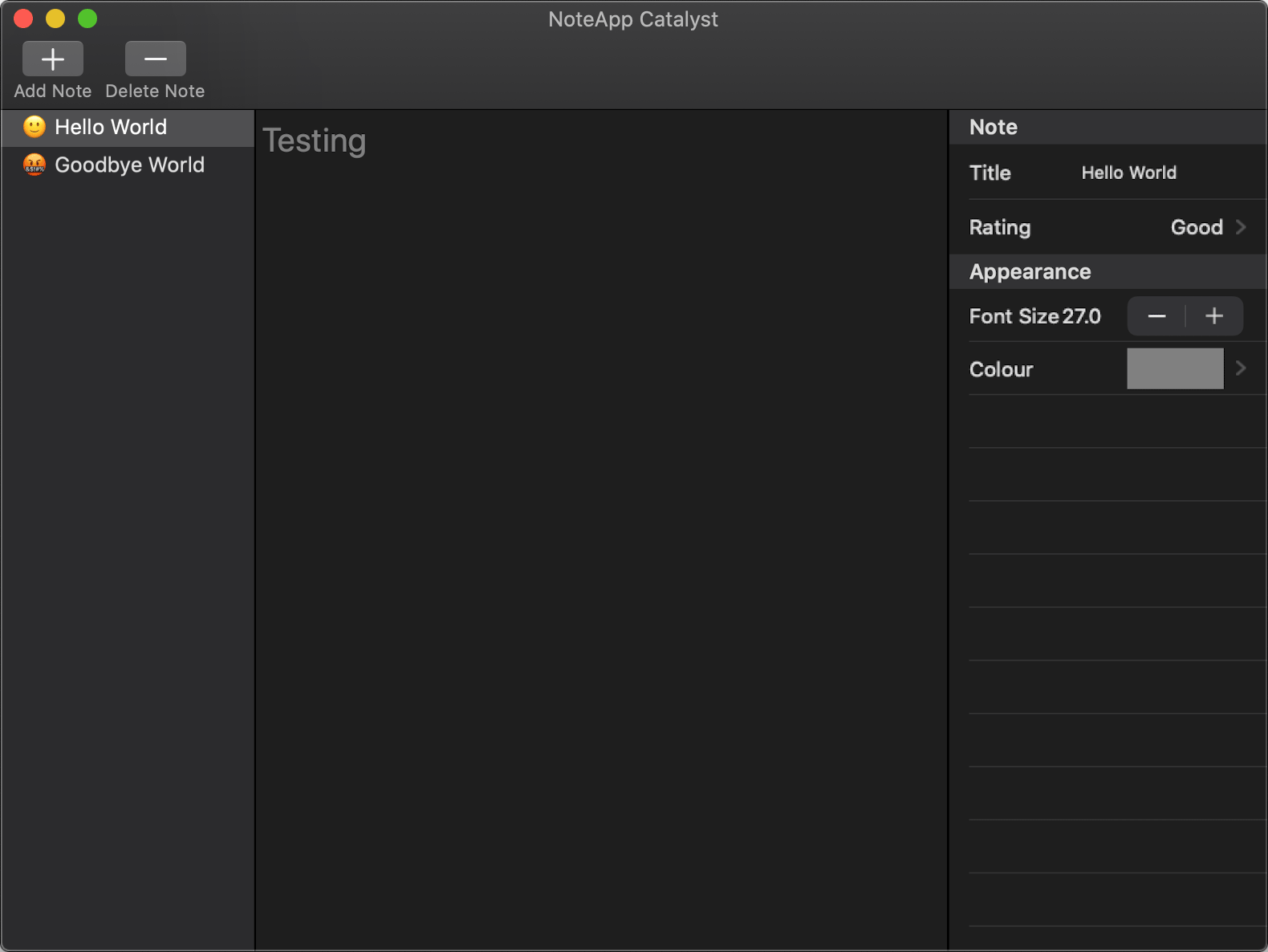
Now there are 2 ways one could fix this. The first is to re-create NSColorWell and NSPopUpButton from scratch. This would obviously be a problematic and time consuming process, to the point of being a non-starter for this example. The other option is to throw the inspector in a separate window, as you can load AppKit windows in a Catalyst app (albeit from a separate bundle). Unfortunately this results in you having to re-do the entire inspector UI, which kind of defeats the point of Catalyst in the first place. It also makes the Mac app feel somewhat old, having inspectors floating around outside the main window (making me ponder whether we should also bring back drawers and brushed metal to complete the retro feel).
Still things could be worse. Which reminds me…
SwiftUI
So I'll get this out of the way now: I love SwiftUI… conceptually. A declarative UI that runs on all Apple platforms, which can adapt controls to best fit the platform it is being used on, and which supports data binding. I'm fully behind this as the future of the platform, which is very much different to how I felt about Swift itself when it was first released.
Unfortunately the thing SwiftUI does share with Swift 1.0 is that it's very much a beta technology that is in no way ready for extensive use. Now part of this is to be expected: it's a brand new UI framework trying to replace existing frameworks that have been built up over years. It is not going to replace every last feature from day one. Unless you're on watchOS, then SwiftUI will at best replace a few views in the vast majority of apps in its current state.
The bigger problem though are the tools and documentation. Compiler errors are useless to the point that it would almost be better that they weren't shown. Xcode's library UI isn't very good for discovering the functionality of SwiftUI as it is missing some views and modifiers, is missing documentation for those it does show, and offers no indication as to which platforms each view or modifier is available on.
The biggest problem though is Swift itself. Having small, lightweight types that have a plethora of extensions that add functionality and protocol conformance is great way to write flexible and composable APIs, but it makes learning those APIs a nightmare. It's bad enough for the Swift standard library, but SwiftUI takes it to a whole new level.
If I'm using UIKit or AppKit and want to learn more about what I can do with a button, I can bring up the header for UI/NSButton. These are generally hand-crafted headers which show almost everything a button can do. Worse case scenario I can jump up the class hierarchy to controls, then views, then responders, then objects. It's easy enough to read and find out how to use a button.
For SwiftUI you get this:
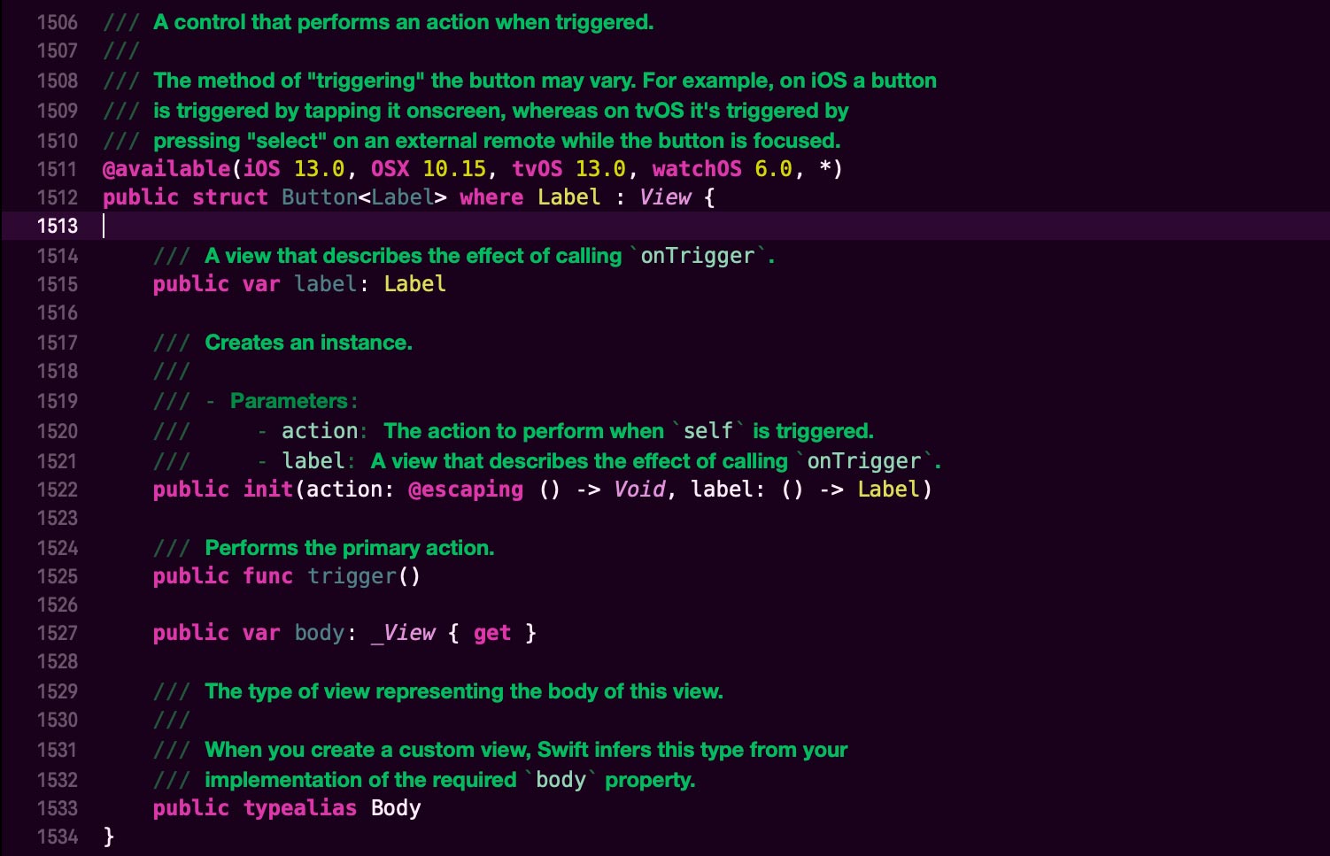
This is a mess. The comments in the header are reasonable, but finding the things you want to call based on property and function names to be able to find the comments to read is impossible as they're scattered in other types. You'll also notice the line count, well over 1500 lines. Well that is because SwiftUI is all in a single header that is 10,165 lines long at the time of writing. TEN THOUSAND, ONE HUNDRED AND SIXTY FIVE!
Apple really needs to spend the next year solving this fundamental flaw in Swift or it risks becoming the next Perl, in being known for being optimised for writing but nigh impossible to decipher afterwards.
All of this is a long-winded way of saying I got this far with the SwiftUI version of the app before giving up due to the immaturity of the tools and documentation (I didn't even attempt porting to the Mac):
I really hope that Apple manages to fix these issues over the coming months, and certainly by the time WWDC 2020 comes around. SwiftUI has so much potential, but it is currently being hindered by problems that are not fundamentally its fault.
Catalyst or SwiftUI?
The best answer I can come up with is: it depends. SwiftUI offers all this potential but is too immature to use extensively. Long term it genuinely could be the best solution but I can't recommend using it on anything too important just yet.
As for Catalyst, if you already have an iPad app and want to create a version that runs on the Mac with minimal effort, then it's certainly adequate for that job and is what I'd recommend for most developers in that situation. Whether or not the resulting app is what most people would consider a proper "Mac app" is up for debate, but you can do a pretty reasonable job depending on the app and the amount of extra work you want to put in.
But what about for me and the app I want to build? Honestly, after starting out with a lot of hope of going with either Catalyst or SwiftUI I've ended up being somewhat disillusioned with both of them. It seems silly, but the least friction I had getting an app that worked on both Mac and iPad was with the first attempt, where I had separate AppKit and UIKit apps. Yes, it requires more work and has less shared code, but it allows me to build for each platform with minimal frustration, and without having to hobble one app to allow for the other, as using Catalyst would require.
Whenever you create a new app you always have to take a bet on the technology you're going to use. For my particular circumstances (a Mac app with a potential iPad app down the line) it seems like the best bet for now is to just go with AppKit and look to see if I can mix in some SwiftUI as and when Apple fixes the many problems with tools and docs. Of course the risk is that Catalyst becomes the actual future and both AppKit and SwiftUI fall by the wayside, but it's not like I would be the first developer to have to re-write an app because of Apple's technological mood swings 🤷♂️